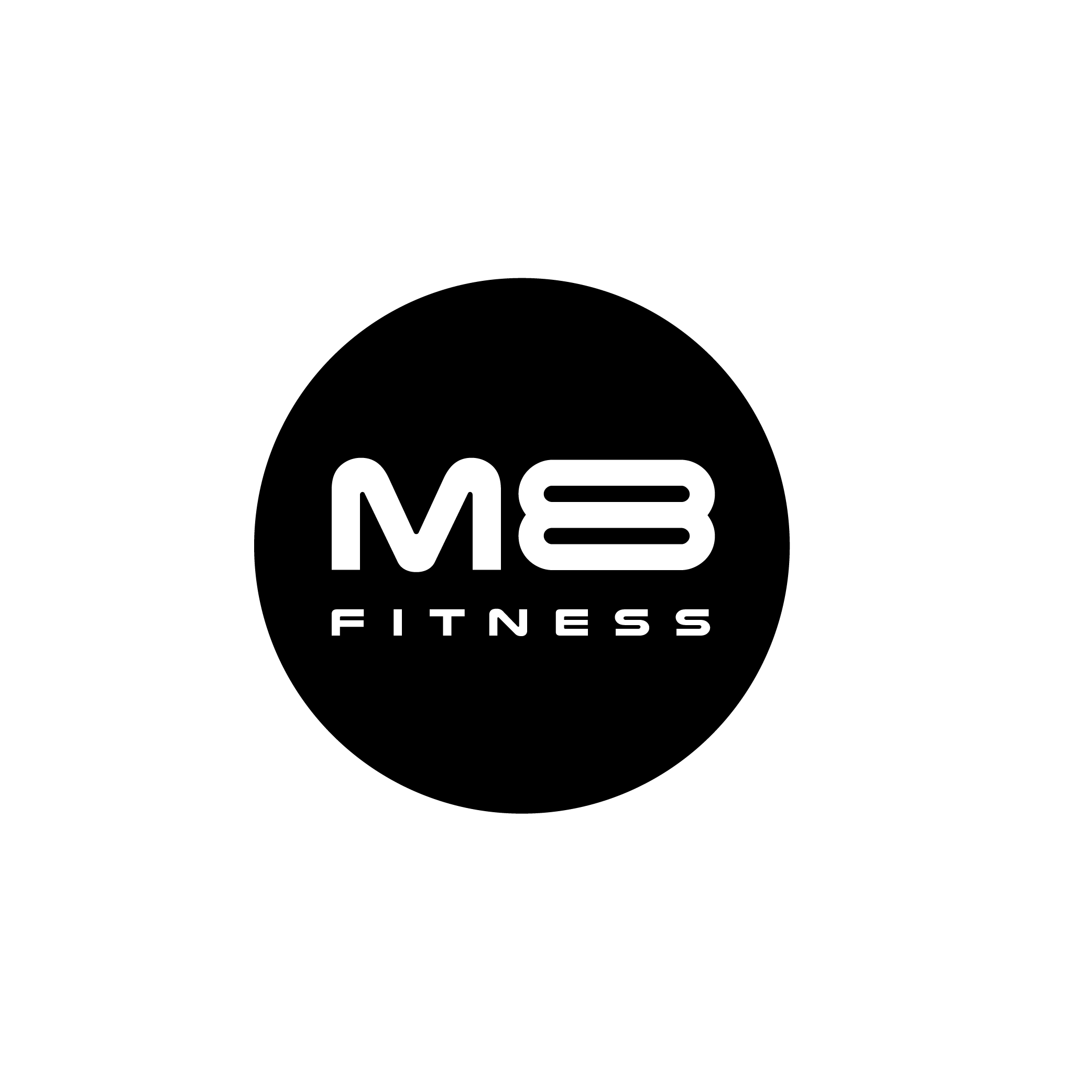
M8 FITNESS
Evolving a creative identity to unite photography, culture, events, and community through curated experiences.

Motivation Reimagined
M8 was developed as a fitness identity built around support, consistency, and sustainable progress rather than pressure-based gym culture.
The goal was to create a brand system that feels encouraging, modern, and confident while helping users feel motivated without intimidation.
The strategy focused on one core belief: people do not always need to be pushed harder. Sometimes they need to feel supported enough to keep going.
From Pressure to Support
Traditional fitness branding often relies on intensity, competition, and perfection. M8 takes a different approach by creating a calm, supportive fitness experience centered on realistic growth.
Intimidating
Aggressive
Performance-first
Pressure-driven
Encouraging
Supportive
Progress-first
Consistency-driven
Design Development
The logo was developed around an open circular form, representing progress in motion. The mark never fully closes because growth is ongoing.
 Wordmark
 Submark
 App Icon
Calm • Supportive • Modern
Balance • Clarity • Structure
Confidence • Contrast • Focus
Encouragement Over Pressure
The voice system was designed to sound supportive, direct, and human. M8 avoids aggressive fitness language and replaces it with messaging that builds confidence through consistency.
No excuses.
Push harder.
Pain is weakness.
Go at your pace.
You showed up. That counts.
Consistency over intensity.
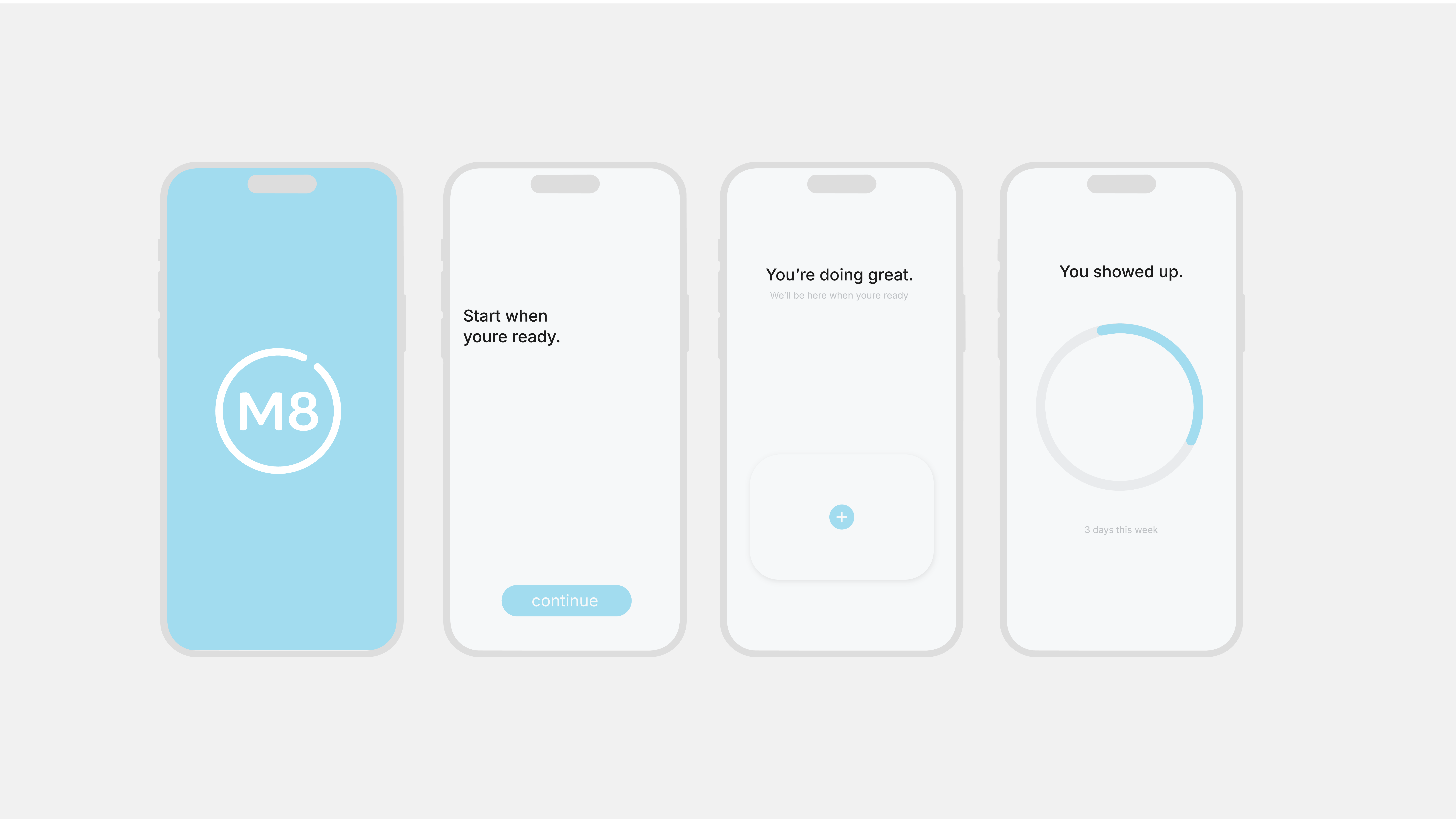
Every screen reinforces the brand's core belief that progress starts with showing up.
Instagram stories exploring progress, movement, and the idea of showing up again.
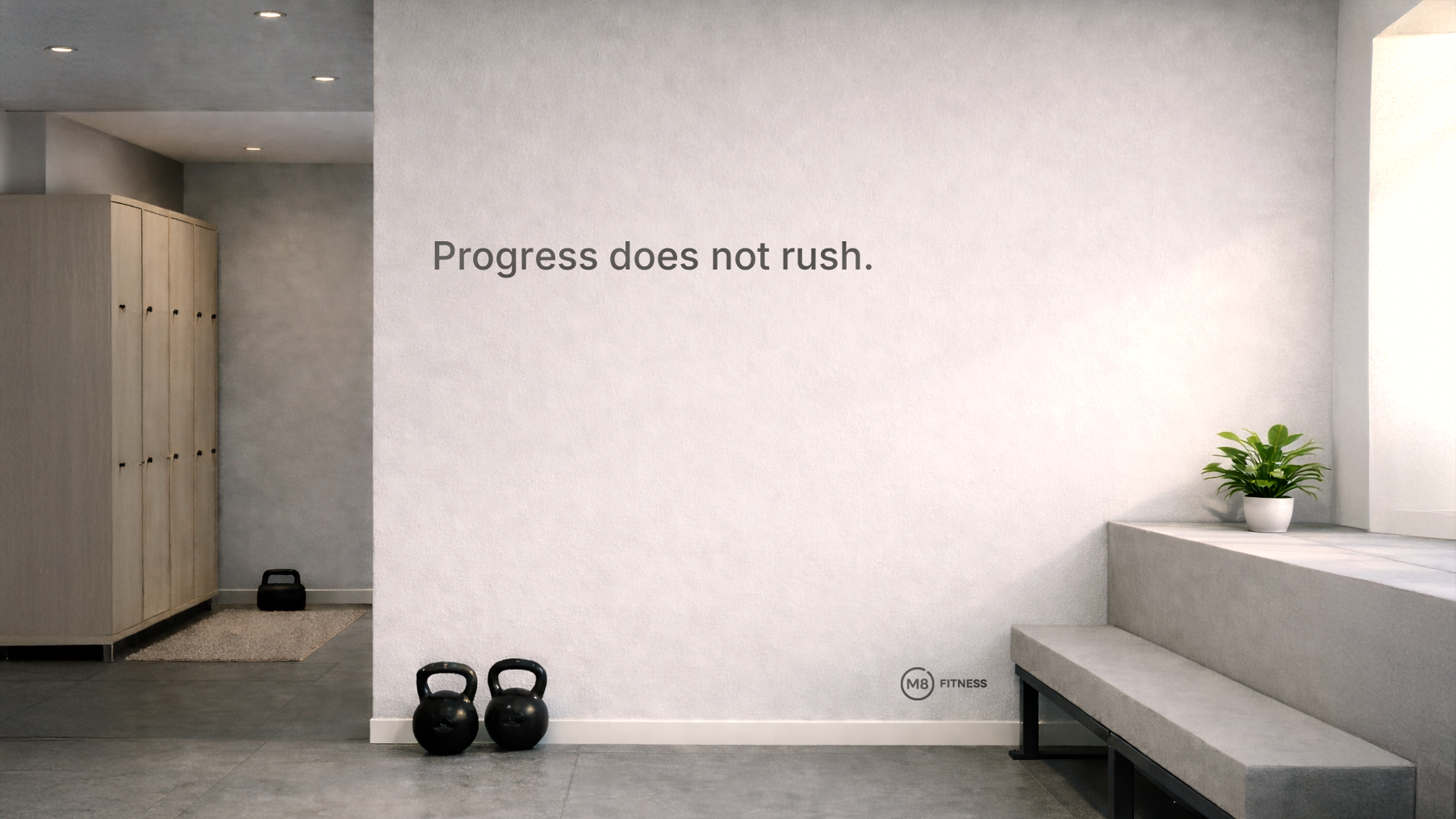
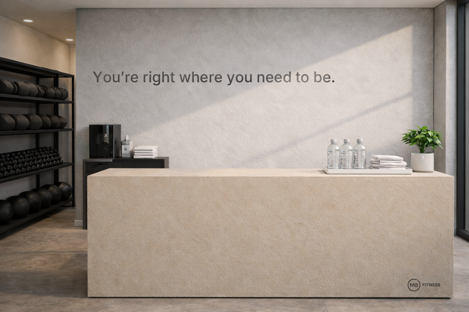
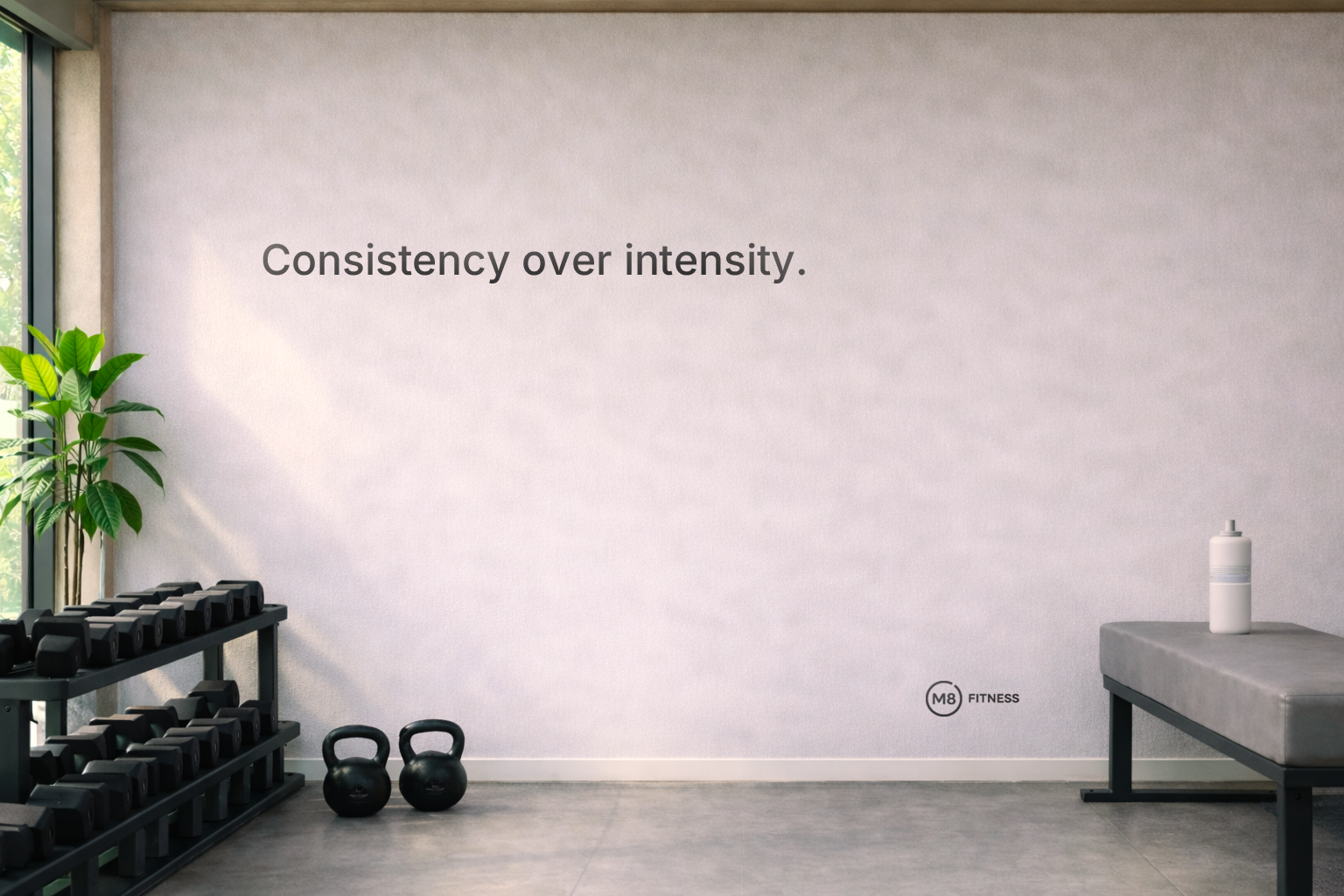
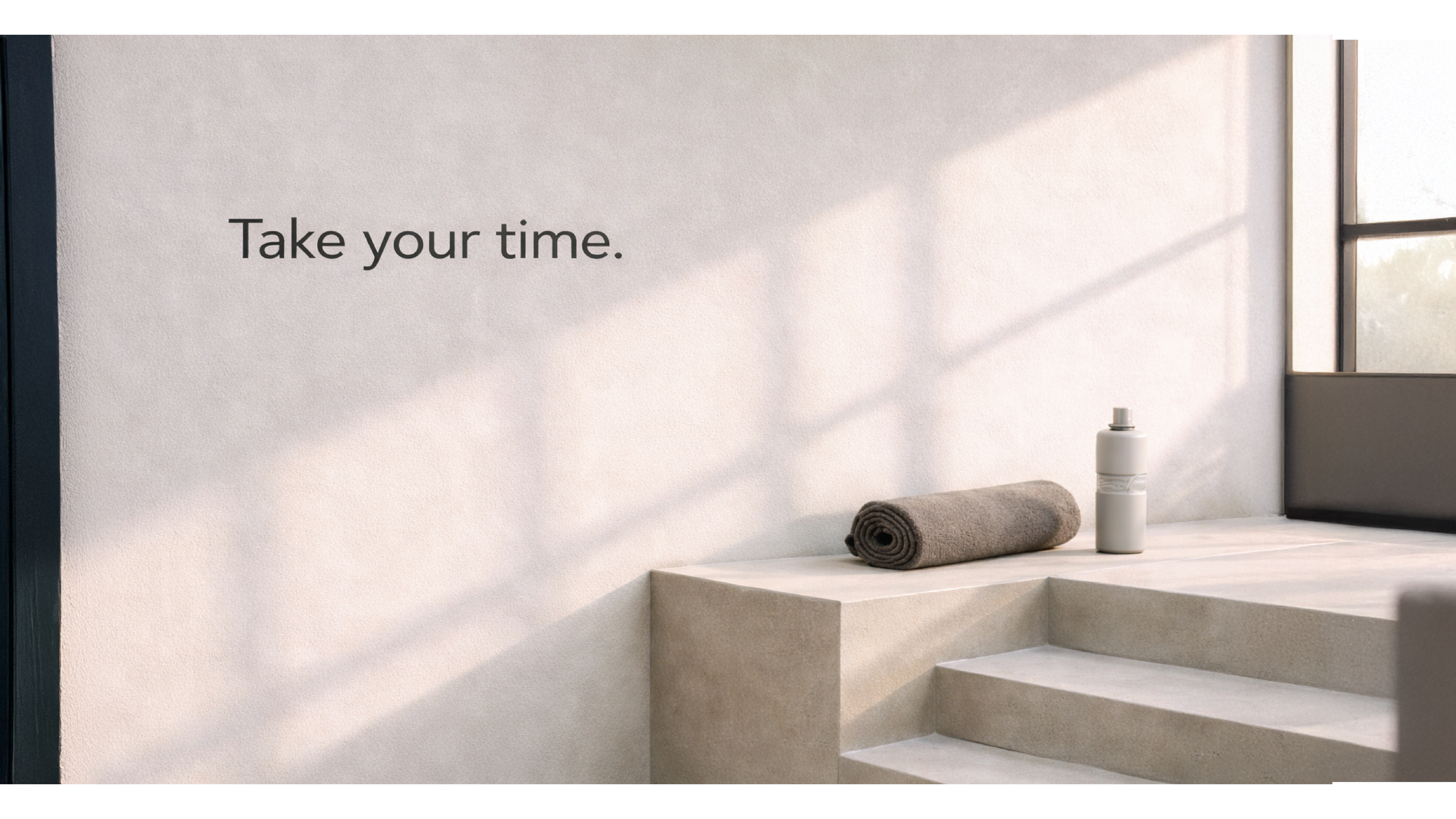
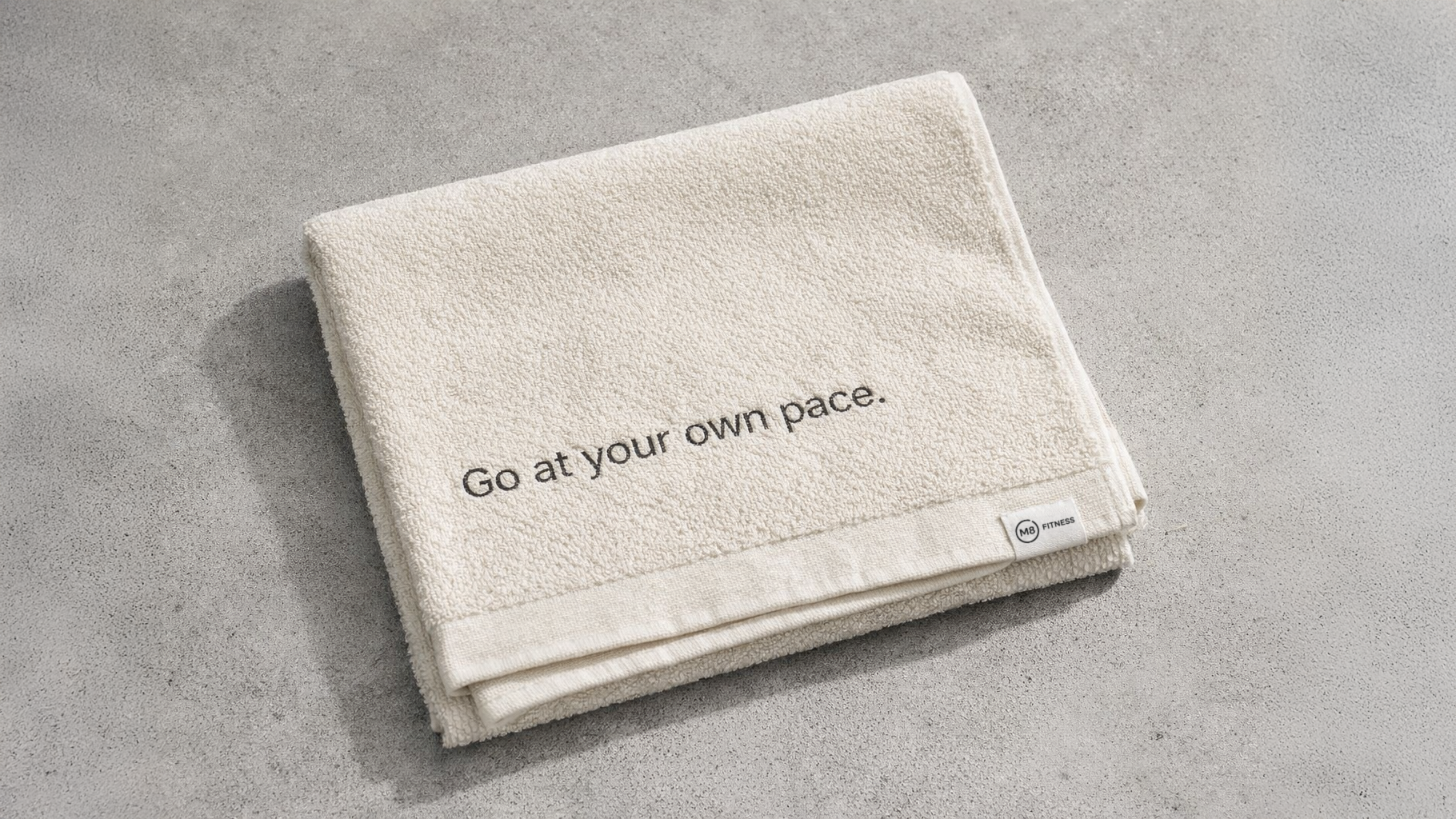
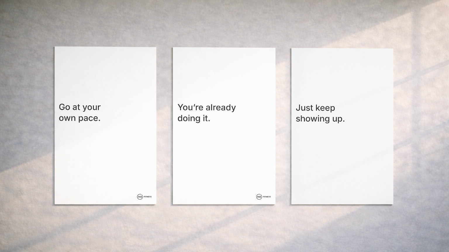
Posters, environmental graphics, and merchandise extending the M8 identity across physical touchpoints.
Logo animation exploring progress, movement, and the idea of showing up again.
Outcome
M8 became a complete fitness identity system built around strategy, behavior, and emotional clarity. The final brand shows how visual design, voice, digital experience, and applications can work together to create a more supportive approach to fitness.